home/case study/riverdale living branding and ui design
riverdale living
#logo #branding #webdesign
partnered with Media Profile

about the
project
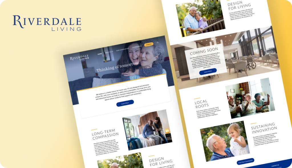
This project involves designing a logo and UI for the Riverdale Living website, which aims to provide individuals and families with a clear understanding of the company’s culture and information about their senior homes.
problem
Riverdale Living manages multiple senior homes across the GTA, but their individual websites were inconsistent and difficult to navigate before the launch of this umbrella company. Broken links and style issues rendered some sites unusable, making it hard for consumers to know they were all part of the same management company.
solution
Riverdale Living’s newly updated website offers a one-stop solution for families seeking information about the company’s communities and services. With each community sharing a unified template, the site establishes and strengthens the connection between each home and the managing company.
logo
Establishing a strong brand identity is critical for businesses to stand out from their competition. Before designing the website, we need to define the brand, and a well-crafted logo plays a vital role in capturing the brand’s essence and making it memorable to customers.

wireframes
Wireframes makes it easier for clients to understand the layout according to how the designer wants the users to navigate the website.

